When I am going through a creative block, or when I am looking for an inventive idea to make my videos more original, I usually resort to two different kinds of inspiration: films trailers and music. If I’m out, away from my computer, I simply listen to soundtracks from my favorite films on my iPhone: the album Classical Kubrick, 8 1/2, The Virgin Suicides, and The Royal Tenembaums are my most popular picks. They bring back memories from some of my favorite films and make me feel like I’m in them. On the other hand, if I am feeling stuck while editing, I usually head over to YouTube and search for film trailers from the 1960s. I feel a special fondness towards them – after all, the 1960s is my favorite decade, filmmaking-wise: the list of masterpieces from this period is too long. Godard, Truffaut, Resnais, Varda, Antonioni, Fellini, Olmi, De Sica, Bergman, Rohmer and Kurosawa – to cite a few names – produced their most stunning work during this golden era. So, when I’m feeling stuck and I don’t have the time to sit through a whole viewing of Godard’s Une Femme Mariée, I simply watch the film’s trailer, trying to absorb as much inspiration as possible. There’s something else that attracts me to film trailers from this period: the clever integration of design and typography to enhance the storytelling.
Cuban-born, Los Angeles-based Pablo Ferro is the absolute master of trailers and film titles. Stanley Kubrick called him a genius – and rightly so: Ferro made brilliant use of quick cutting and handwritten letter design to create a punchy trailer and a stunning opening sequence for Dr. Strangelove:
In this insightful post on Typotheque, Steven Heller explains why Pablo Ferro’s work is regarded as so groundbreaking.
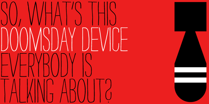
Since I do a lot of work in graphic and web design as well, I am naturally drawn to this mixture of brilliant typography and filmmaking. Yesterday morning I received an email from stock photography and font repository Veer.com, stating that my 10 remaining purchasing credits were about to expire. So I went to the site, looking for stock photos and fonts to purchase to extinguish my credit. That’s when I stumbled upon the family font Strangelove (incidentally worth 9 Veer credits) – which looks exactly like Ferro’s handwriting in the opening sequence of Dr. Strangelove. I immediately purchased it and I can’t wait to find an excuse to start using it… Well, first use below:


Funny I once tried to get a job with him – this was back in the 70’s and I had no business being there I just wanted to meet him because I knew his work and liked it so much as well. Very nice guy – not at all the typical Hollywood/cool-a-matic designer – well anyway his studio was on west 45-46th st somewhere.Even though he saw right away I wasn’t a designer he took the time to evaluate the crap I showed him and encourage me (maybe to pursue a career in law) but anyway a lovely and gracious man.
Is he still alive? Working? This is a wonderful tribute.
David
Wow, what a wonderful story, David!
I think that Pablo Ferro is currently retired, living in Los Angeles: http://www.aiga.org/content.cfm/medalist-pabloferro